Author name: solarbluseth

Custom PHP Development

Behind the Scenes: Advanced Themer 13 — Hooking the SEO Page to Your Pages and Posts

Behind the Scenes: Advanced Themer 13 — Hooking the SEO Page to Your Pages and Posts

This one’s for the WordPress devs. When I rebuilt Advanced Themer’s SEO Options page for version 13, I recoded every field from the legacy v12 plugin into proper registered settings — meta description, keywords, title prefixes and suffixes, the works. The form saved. The options persisted. Everything looked done.

It wasn’t. Every single at13_seo_* option was write-only. The admin page saved them, and nothing on the front end ever read them. No wp_head output, no title filters, nothing. A settings page that faithfully stores your input and then does absolutely nothing with it. (In fairness to v13 — the legacy plugin had the same problem in more than one place. The v12 CSS page rendered its whole Quick Styles form without ever calling register_setting(), so WordPress silently refused to save it at all.)

Here’s how the consumer side got built.

The Per-Page SEO Meta Box

The SEO Options page had a “Per-Page SEO Box” checkbox that was literally a flag pointing at a future build. That build is now real: when the flag is on, Pages and Posts get a meta box with three fields — SEO Title override, Meta Description, and Meta Keywords.

add_action('add_meta_boxes', function () {
    if (!get_option('at13_seo_pp_section_enabled')) return;
    foreach (['page', 'post'] as $type) {
        add_meta_box(
            'at13_seo_meta_box',
            __('SEO — Advanced Themer 13', 'advanced-themer-13'),
            'at13_render_seo_meta_box',
            $type,
            'normal',
            'default'
        );
    }
});

The save handler is standard hardening: nonce check, autosave bail, capability check. One detail worth stealing — empty fields delete the post meta instead of storing empty strings, so the postmeta table doesn’t fill up with blank rows for every page you never customized:

foreach (at13_seo_meta_fields() as $key => $sanitize) {
    $value = isset($_POST[$key]) ? call_user_func($sanitize, wp_unslash($_POST[$key])) : '';
    if ($value === '') {
        delete_post_meta($post_id, $key);
    } else {
        update_post_meta($post_id, $key, $value);
    }
}

The field list itself lives in one small function mapping meta key to sanitize callback, so the render and save sides can never drift out of sync.

Precedence: Per-Page Beats Global

Every front-end output follows the same chain: per-page meta box value → global option (if its enable checkbox is on) → nothing. One helper enforces the gate:

function at13_seo_get_page_meta($key) {
    if (!get_option('at13_seo_pp_section_enabled')) return '';
    if (!is_singular(['post', 'page'])) return '';
    return get_post_meta(get_queried_object_id(), $key, true);
}

Turn the meta box off and every per-page value stops applying instantly — the data stays in postmeta, but nothing reads it. One kill switch, no orphaned behavior.

Titles: document_title_parts, Not wp_title

Title overrides go through the modern document_title_parts filter. The per-page SEO title replaces the core title part, then the prefix/suffix chains stack on top — article prefix/suffix on single posts, category prefix/suffix on category archives, and the global prefix/suffix outermost so it applies everywhere:

add_filter('document_title_parts', function ($parts) {
    $custom = at13_seo_get_page_meta('_at13_seo_title');
    if ($custom) $parts['title'] = $custom;

    $title = isset($parts['title']) ? $parts['title'] : '';

    if (is_singular('post')) {
        if (get_option('at13_seo_article_prefix_enabled') && ($p = get_option('at13_seo_article_prefix'))) $title = $p . ' ' . $title;
        if (get_option('at13_seo_article_suffix_enabled') && ($s = get_option('at13_seo_article_suffix'))) $title = $title . ' ' . $s;
    }
    // ... category + global chains follow the same pattern

    $parts['title'] = trim($title);
    return $parts;
});

Because it’s document_title_parts and not a full pre_get_document_title hijack, the separator and site-name parts that the theme (or another plugin) manages stay intact.

Meta Tags at Priority 1

Description and keywords print on wp_head at priority 1, so they land high in <head> before the pile of styles and scripts. Values get wp_strip_all_tags() plus esc_attr() on the way out — options are sanitized at save time, but output escaping is not optional just because input was clean.

The Fun One: Keyword Deep Links

The SEO page lets you define up to three keyword/link/alt sets. On the front end, each keyword’s first plain-text occurrence in post content gets auto-linked. The regex is where it gets interesting:

$pattern = '/\b(' . preg_quote($keyword, '/') . ')\b(?![^<]*>)(?![^<>]*<\/a>)/i';
$content = preg_replace($pattern, $replace, $content, 1);

Two negative lookaheads do the safety work: the first skips matches sitting inside an HTML tag (so a keyword in an alt="" attribute never gets mangled), the second skips text that’s already inside a link (no nested anchors). The 1 limit on preg_replace keeps it to one link per keyword — auto-linking every occurrence is how content starts reading like 2006 spam. The filter also checks in_the_loop() && is_main_query() so it doesn’t fire on excerpts, widgets, or secondary queries.

The Rest of the Wiring

Menu prefix/suffix bookend nav menus as plain list items via wp_nav_menu_items. The Author Title option swaps WordPress’s default “Author:” archive label through get_the_archive_title_prefix — a filter a lot of devs don’t know exists. Footer HTML outputs on wp_footer, run through wp_kses_post().

And one field deliberately stayed unwired: Deep Link Keywords, a lone text input with no link target and no clear consumer even in the legacy code. Shipping a behavior I’d be guessing at is worse than shipping a field that visibly does nothing — it’s parked until it has a real spec.

The Takeaway

A settings page isn’t a feature. It’s half of one. The other half is the hooks that actually consume what it saves — and it’s shockingly easy, especially when porting legacy code, to build the form, watch it save, and call it done. If you’re auditing an old plugin, grep for get_option() on every option the admin registers. The ones that only ever appear inside the admin form itself? Those are your write-only settings, and your users have been checking boxes that do nothing.

Advanced Themer 13’s SEO page now does what it always looked like it did. Tested on live pages and posts — per-page overrides, title chains, meta tags, keyword links, all firing.

Custom PHP Development

Four Real-World PHP, MySQL, and API Problems

Four Real-World PHP, MySQL, and API Problems (and the Fixes)

Most internal admin tools follow the same arc: a PHP script talks to a couple of third-party APIs, writes the results into MySQL, and renders a table so a human can act on the data. It’s a simple shape, but it hides a handful of failure modes that show up in almost every tool built this way. Here are four of them, pulled from a real lead-generation dashboard that pulls business listings via SerpApi and enriches them with the Google Places API — along with the fixes.

1. Your usage counter and the provider’s usage counter will disagree

A lot of API-gated tools track their own call count in a local table — insert a row per call, sum it up, compare against a limit, stop when you hit it. It looks correct, and it is, right up until it isn’t: a request that times out before reaching the provider still gets counted locally even though the provider never saw it; a manual test call made outside the script doesn’t get counted at all; a billing-cycle boundary gets computed with a different timezone than the provider uses. None of these are dramatic bugs. They just quietly accumulate until your local count and the provider’s real count are two different numbers, and your gating logic starts blocking work that the provider would happily still allow.

The fix is to stop maintaining a shadow ledger and ask the provider directly. Most metered APIs expose a free account/usage endpoint specifically for this — SerpApi’s account.json, for example, returns this_month_usage, searches_per_month, and plan_searches_left, and querying it doesn’t count against your quota:

function serpapi_account(): array {
    static $cache = null;
    if ($cache !== null) return $cache;
    $url = 'https://serpapi.com/account.json?api_key=' . urlencode(SERPAPI_KEY);
    $raw = curl_get($url, 6);
    $data = $raw ? json_decode($raw, true) : null;
    if (!is_array($data) || !empty($data['error'])) {
        return $cache = ['ok' => false, 'error' => $data['error'] ?? 'Could not reach account API'];
    }
    $data['ok'] = true;
    return $cache = $data;
}

The local table is still useful as a fallback for the rare moment the account endpoint is unreachable, but it’s no longer the source of truth — the provider is. That one change makes an entire class of “why is this stuck” bugs disappear, because there’s nothing left to drift.

2. Data your code captures but your UI never shows

Enrichment steps tend to grow incrementally — you add a field to the database schema, write it on insert, maybe wire it into a CSV export, and move on. It’s easy to forget the one place that actually matters: whether the field is rendered anywhere a person will look. In this case, a full street address was being fetched from the Google Places API, written to MySQL, and included in the CSV export — but the on-screen leads table never had a column for it. The data existed everywhere except where someone would actually see it.

The fix isn’t just “add a column” — it’s worth checking what your SELECT * payload actually contains versus what your template renders, since that gap is where this bug lives. Once it surfaces, putting the field where it makes sense (nested under the business name, rather than burning a whole new column for one line of text) is usually the better call.

3. Tables grow a column per field until they’re unreadable

Every new enrichment field is tempting to give its own column, and a table that started at five columns ends up at ten, most of them mostly redundant with their neighbors. Category and industry are almost always read together. An area code is meaningless without the town it belongs to. An email address is just another way to reach the same business as the phone number next to it.

Collapsing related fields into a single cell — a bold value with a muted line underneath — recovers most of that width without losing any information:

<td><span class="bdg bl">${e(l.location)}</span> <span class="bdg ba">${e(l.area_code)}</span></td>
<td><span class="bdg bc">${e(l.category)}</span><br><span class="muted">${e(l.industry)}</span></td>
<td>${phoneLink}<br><span class="muted">${emailLink}</span></td>

It’s also worth turning passively-captured data into something clickable. An address that’s already sitting in the database doesn’t need a new API call to become useful — it just needs a link:

function mapsLink(lead) {
  const q = lead.address || `${lead.name} ${lead.location}`;
  return 'https://www.google.com/maps/search/?api=1&query=' + encodeURIComponent(q);
}

No geocoding API, no extra request — just a URL pattern Google Maps already understands.

4. Hiding a CSS Grid item can break its sibling’s position

This one isn’t PHP or MySQL, but it’s the kind of bug this style of tool runs into constantly: a two-column CSS Grid layout (grid-template-columns: 310px 1fr) with a sidebar and a results panel. Adding a “hide sidebar” toggle via display: none on the sidebar seems harmless — until the results panel collapses to a sliver.

The reason: a grid item with display: none is removed from grid placement entirely, not just hidden visually. Without an explicit grid-column assigned to the surviving item, the browser re-flows it into the first available track — which, with the sidebar gone, is now the track that used to belong to the sidebar (and which you’ve shrunk to zero width). The fix is to stop relying on auto-placement and pin both items explicitly:

.grid > .sidebar { grid-column: 1; }
.grid > .results { grid-column: 2; }

Now hiding the sidebar only removes its content — its sibling stays exactly where it’s supposed to be, regardless of what’s visible around it.


None of these are exotic problems. They’re the default failure modes of “PHP script talks to an API, writes to MySQL, renders a table” — which is most of what internal tooling actually is. The fixes are small, but they’re the kind of thing that’s much easier to write down once than to rediscover from scratch every time.

Custom PHP Development

picturethis

PHP Programming

Bring back old photos 

share again, live again enjoy again. 

I have about 30 years of photos sitting on a hard drive. Weddings, road trips, concerts, random Tuesday nights that somehow became important memories. They were a mess — duplicates everywhere, iPhoto libraries inside iPhoto libraries, GoPro footage mixed in with birthday photos from 2003. I needed to sort them. I did not want to pay Adobe or Google or anyone else a monthly fee to do it.

So I built something.

This is the story of how a single PHP flag I had never used in 30 years of web development turned into a full photo management suite running entirely on my Mac — no subscription, no cloud upload, no third-party app. Just PHP, MySQL, a browser, and a little help from Claude.


The Problem

The drive in question is called sethstudio1. It has year folders going back to 2002. Inside those year folders is chaos — Live Photo MOV clips paired with their HEICs, JPG duplicates of photos that already existed as HEICs, macOS junk like .DS_Store and __MACOSX folders scattered everywhere, sidecar files from every version of iPhoto and Photos that ever touched the drive.

Before I could sort anything I needed to clean. The first thing we built was a PHP command-line script that recursively walked the entire drive and removed:

  • Metadata and sidecar files (.aae, .xmp, .thm, .json)
  • macOS junk (.DS_Store, __MACOSX folders, Thumbs.db)
  • Live Photo MOV clips where a matching HEIC or JPG existed
  • JPG duplicates where a HEIC twin existed in the same folder
  • Exact duplicates detected by filename and file size
  • Empty directories left behind after cleanup
10GB cleaned up — 8,834 files removed

First pass results — nearly 10GB freed before touching a single photo.
🗑 8,834 files deleted  ·  9.94 GB freed in one pass

Those 8,147 duplicates were the big one — the result of backing up iPhoto libraries on top of each other for two decades without ever cleaning up.


The PHP Thing Nobody Talks About

I have been writing PHP since 1996. I have built thousands of WordPress sites, custom CRMs, billing systems, employee dashboards. I know PHP.

I did not know about this:

php -S localhost:8765

One flag. That is it. PHP has had a built-in web server since version 5.4 — released in 2012 — and I had never used it. Pass a script filename after the address and every request routes through that file first, giving you a fully functional HTTP server with zero Apache configuration, zero nginx, zero WAMP virtual host setup.

PHP built-in server running on localhost:8765

One terminal command. One PHP file. A complete local web server.

So that became the architecture. A single PHP file — photo_review_api.php — that serves as both the web server and the API. Visit / in a browser and it serves the HTML interface. Send a POST request with {"action":"scan"} and it recursively indexes your photo drive into MySQL. Send {"action":"move"} and it physically moves files on disk and updates the database. Everything stays on your machine.


What the Reviewer Does

The photo reviewer is a dark-mode web app that runs in your browser, connected to the local PHP server. From the grid view you can:

📅 Scan by year folder
👤 People tagging
📁 Category assignment
🔒 Private categories
🎨 Open in Photoshop
✉️ Email as attachment
📋 Copy to clipboard
🌐 Push to WordPress site
⤢ Fullscreen lightbox
🗑 Batch delete

The category system knows the difference between people and places. Check one person — photo moves to their folder. Check two or more people — photo goes to a friends folder automatically. The individual people are still saved as tags in the database so you can filter by person later. Private categories are hidden by default and require toggling a switch to reveal — safe to use if a client is watching over your shoulder.

Photo reviewer grid view

The grid view — hover for quick actions, click to select, assign category.
SolarBlu Tools launcher

The launcher — double-click in Finder, all tools start, browser opens.

The workflow defaults to showing only unsorted photos. As you assign categories, photos disappear from the grid and the next one auto-selects. You can move through hundreds of photos fast.


Personal and Business Workspaces

About halfway through building the personal reviewer it became obvious the same tool could handle client work. SolarBlu does web design and hosting for small businesses across Illinois — and clients often have the same problem. Photos scattered across drives, no organization, no system.

So we added a workspace switcher:

  • Personal Scans the sethstudio1 drive, people and places categories, private protection, full personal workflow
  • Business Scans the Solarblu_Projects folder, client folders as categories, moves files into a proper clients/[clientname]/ structure

Add a new client with one click and their folder is created automatically. The whole interface tints amber in business mode so you always know which workspace you are in. Both share the same MySQL database but keep their data completely separate.


The Shell Command Trick

Because the PHP server runs locally on the Mac it has full access to shell commands. So we added a shell_open API action that fires native Mac commands when you click a button in the browser:

  • Photoshopopen -a "Adobe Photoshop 2026" /path/to/file
  • Finderopen -R /path/to/file reveals the file in its folder
  • Mail — AppleScript composes a new message with the photo already attached
  • WordPress — copies the file directly into any of your sites' uploads folders

This only works because everything is local. A hosted web app could never do this. The browser talks to a local PHP server that has shell access to the same Mac — that is the whole trick.


What Is Next

  • Quick-move overlay — click people's names directly on the photo without touching the sidebar
  • Screenshots folder integration — hook the Mac screenshots directory into the reviewer
  • External drive support — plug in a client's drive, pick it from a dropdown, sort their photos into the right client folder
  • Slideshow — sorted photos feed into a fullscreen slideshow that AirPlays to Apple TV
  • More tools on the launcher — CRM dashboard, billing tool, content scheduler, all on their own ports

If you are a small business owner drowning in unorganized photos — client headshots, product shots, event archives — this is something SolarBlu can build for you as a custom local tool tailored to your workflow.

Let's Talk →

Custom PHP Development

pv-casestudy1

Portfolio Case Study

Pavlov Media
Homepage Redesign

A full ground-up rebuild in WordPress + Elementor Pro — taking a dark, B2B-coded legacy homepage and transforming it into a warm, consumer-first fiber internet experience built for residential sign-ups.

Platform: WordPress + Elementor Pro
Theme: Astra 
Client: Pavlov Media
Before: March 2023 → After: 2024
Sections: 10 (was 6)
Work completed by Seth Rhoads while serving as Web Developer at Pavlov Media

Overview

Why the Old Site Needed a Ground-Up Rethink

Pavlov Media provides fiber-optic internet to residential communities and MDUs across 44 US states. Over several years their homepage had accumulated layer upon layer of incremental changes on top of a legacy WordPress theme — the result was a dark, text-heavy, enterprise-coded experience that no longer matched their fast-growing residential consumer audience.

The core problem: Every design decision on the original homepage — the dual navigation, the near-black palette, the B2B copywriting, the complete absence of pricing — was aimed at property managers and institutions. When a regular homeowner landed on the page there was nothing pulling them forward: no lifestyle imagery, no address lookup, no reviews, no plain-language value props, and no clear path to actually sign up.

The redesign meant starting over inside Elementor Pro on a clean Astra theme base — defining a global design system first (colours, typography, spacing tokens, reusable CSS classes), then building every section from scratch, and finally layering targeted custom CSS for anything the builder couldn't handle alone.

Hero — Before & After

The First Thing Visitors See

The hero is the thesis of the homepage. It tells visitors in 2–3 seconds whether this site is for them. The old hero communicated "enterprise tech company." The new hero communicates "this is for your home, and here's how to get started right now."

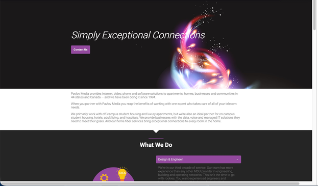
Before — March 2023 (Wayback Archive)

Old Pavlov Media homepage — dark hero with glowing tablet illustration, Simply Exceptional Connections tagline, double nav stack

Dark, abstract, corporate. Black background, glowing energy-orb illustration over a floating tablet, italic tagline "Simply Exceptional Connections." Two stacked nav rows (MDU Solutions / Business Solutions / Home Solutions / Investor Relations + a second bar: Home / About / News / Contact / Careers / Legal / MyAccount). The only CTA is a plain "Contact Us" button. No pricing, no address lookup, no residential hook anywhere above the fold.
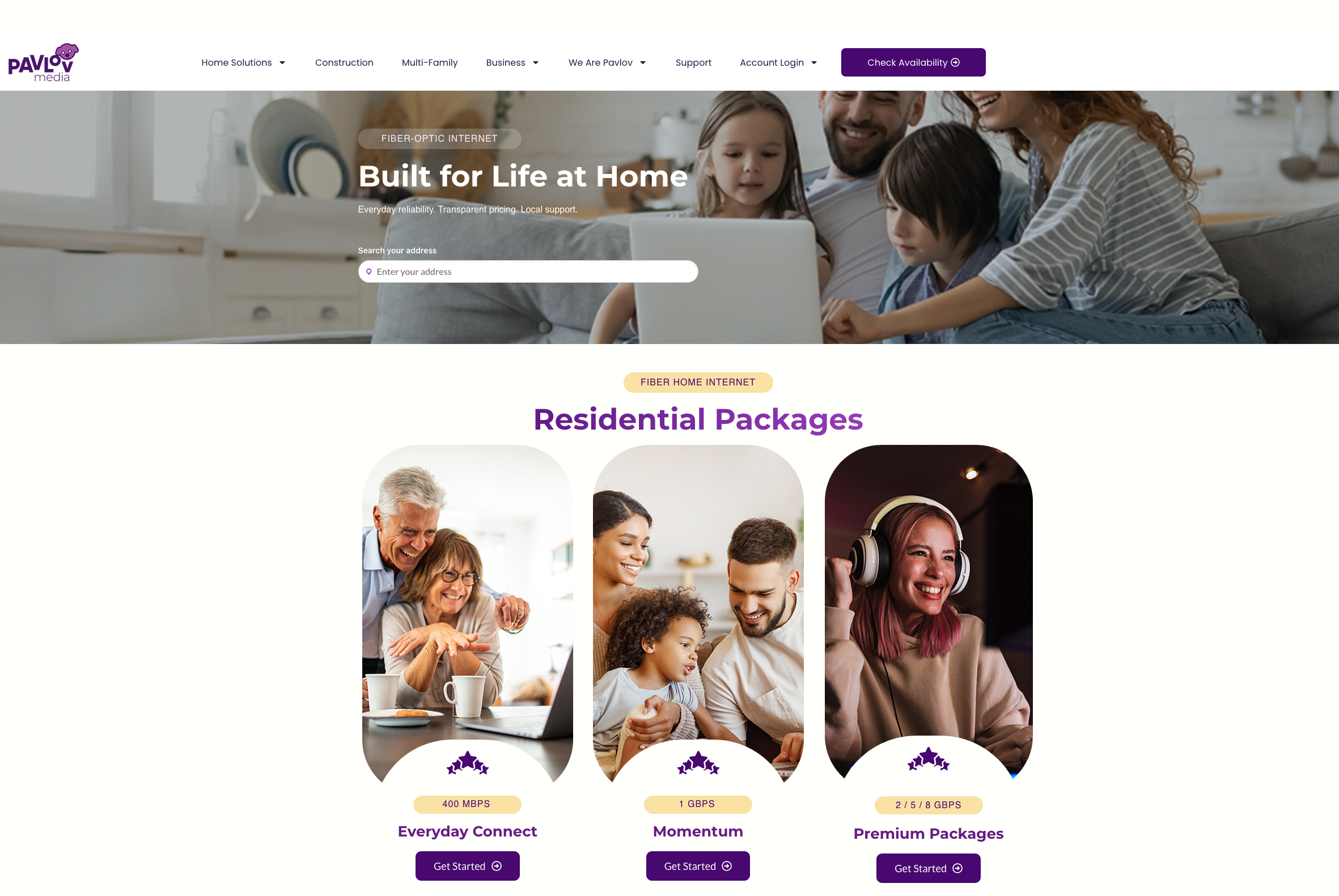
After — 2024 Redesign (pavlovmedia.com)

New Pavlov Media homepage — bright lifestyle family photo hero with Built for Life at Home headline, address search bar, single clean nav with Check Availability CTA

Warm, residential, action-oriented. Full-bleed lifestyle photo of a real family using fiber at home. Single clean sticky nav: logo, 5 consumer-language links, one persistent purple "Check Availability" button. "FIBER-OPTIC INTERNET" pill label, bold headline "Built for Life at Home," three-part sub-copy (Everyday reliability · Transparent pricing · Local support), and an address search bar as the primary CTA — the most important first step for a geo-limited ISP, directly on the hero. 🌐 EN language selector visible bottom-right.

The address search bar is the single biggest conversion improvement on the page. For a geo-limited ISP, every potential customer's first question is "do you serve my address?" Answering that on the hero — before any scrolling — removes the biggest barrier to entry. Visitors who confirm their address are already partially converted.

The Old Site — Section by Section

2023 Homepage (Archived March 8, 2023)

The 2023 homepage had 6 sections with no connecting visual rhythm, no residential pricing, no reviews, and no address lookup. Every section was written for property managers and institutional procurement teams rather than homeowners.

01 — Hero + Double Nav

Old site hero with double nav

Problems: Two stacked nav rows with B2B-only labels. "Simply Exceptional Connections" tagline aimed at enterprise. "Contact Us" as only CTA. No residential content above the fold.
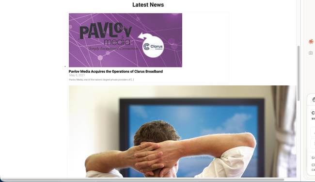
02 — Latest News (top)

Old site latest news top

Problems: Full homepage real estate used for stacked news articles — top story is a 2021 acquisition. No grid, no hierarchy, no residential value props. Content was 3 years stale.
03 — Latest News (continued)

Old site latest news continued

Problems: More stacked news articles (Orlando data center, Clarus Broadband acquisition). B2B press release content taking up the majority of the scrollable homepage. No path to sign up.
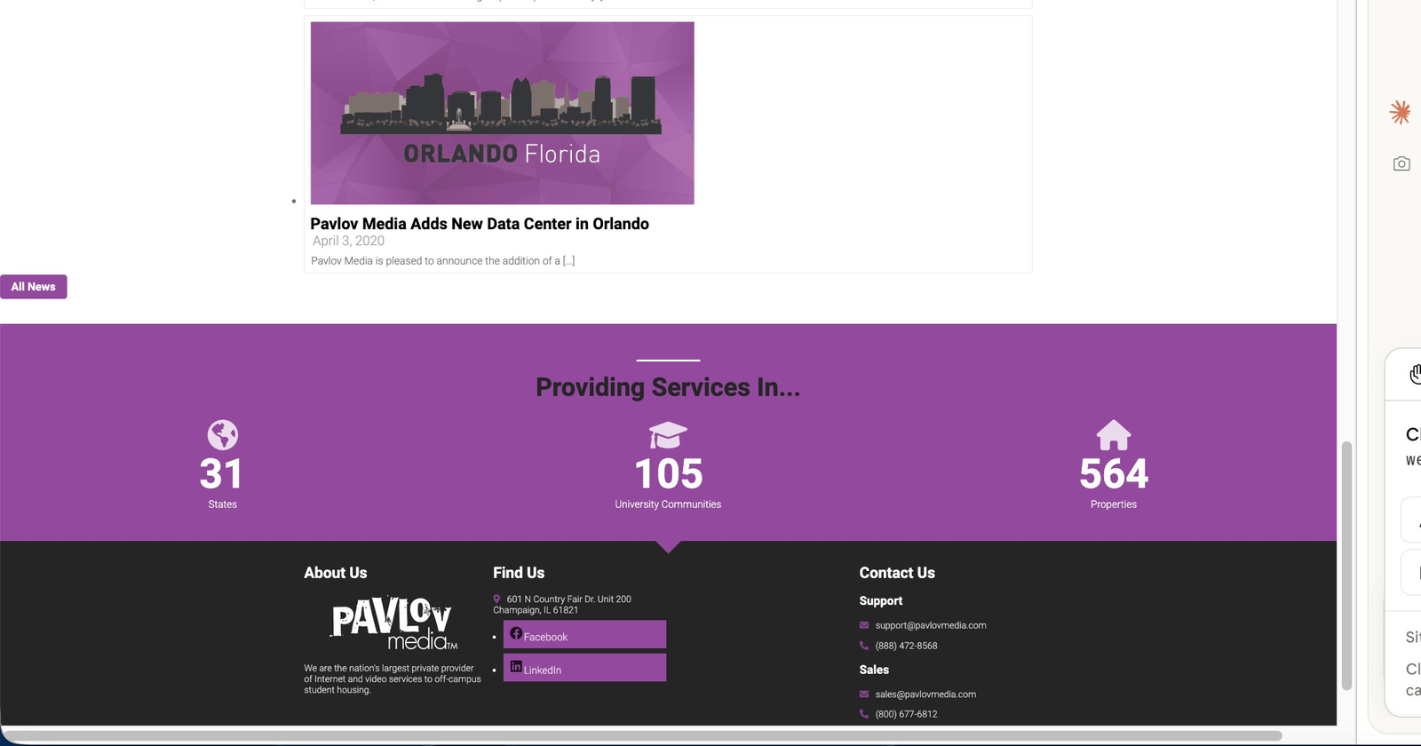
04 — Stats + Footer

Old site stats banner and footer

Problems: B2B metrics only — 31 States / 105 University Communities / 564 Properties. Dark footer with only Facebook + LinkedIn, 3 columns, no site map, no language option. Nothing residential.

Old site summary: 6 sections · 0 residential pricing · 0 reviews or social proof · 0 lifestyle photography · 0 address lookup · All stats aimed at institutional buyers · Stale news content · Navigation designed entirely for B2B audiences · No language support · No mobile optimisation beyond theme defaults

The New Site — Section by Section

2024 Redesign (10 Sections)

The redesign follows a deliberate awareness → interest → trust → decision information flow. Each section has a single job. White and cream backgrounds alternate for natural visual rest. B2B audiences are served — but in a dedicated card section that doesn't disrupt the residential flow.

01 — Hero + Single Nav

New site hero Built for Life at Home

Job: Awareness → Action. Family lifestyle photo, "Built for Life at Home," address search bar as primary CTA. Single sticky nav with "Check Availability" button. Language switcher (EN) visible.
02 — Residential Packages

New site residential packages plan cards

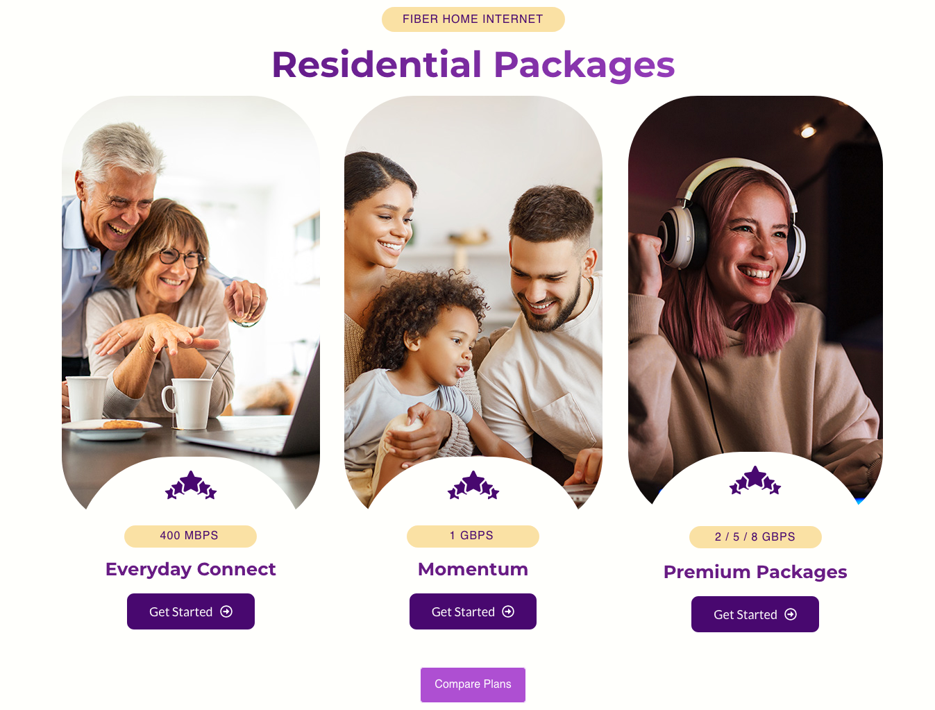
Job: Interest. Three lifestyle photo plan cards — Everyday Connect (400Mbps), Momentum (1Gbps), Premium (2/5/8Gbps) — with speed badges, star icons, and "Get Started" buttons. Pricing visible immediately below the hero.
03 — Why Us

New site Why Us warm cream section

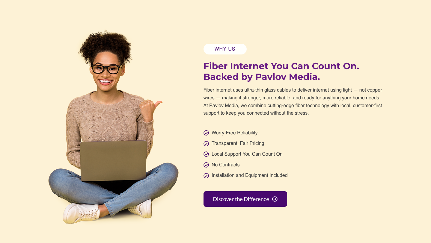
Job: Differentiation. Warm cream background, "WHY US" pill label, cut-out woman with laptop, "Fiber Internet You Can Count On" headline, 5-item checklist (Worry-Free Reliability, Transparent Fair Pricing, Local Support, No Contracts, Installation Included), "Discover the Difference" CTA.
04 — Content Grid

New site asymmetric content grid

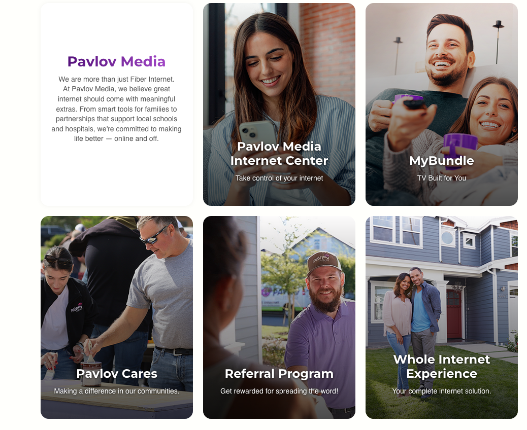
Job: Discovery. Asymmetric grid mixing full-bleed photo cards (Internet Center, MyBundle, Pavlov Cares, Referral Program) with flat feature cards (Whole Internet Experience). Visual variety through alternating card formats.
05 — Benefits + Reviews

New site benefits split section and Google reviews carousel

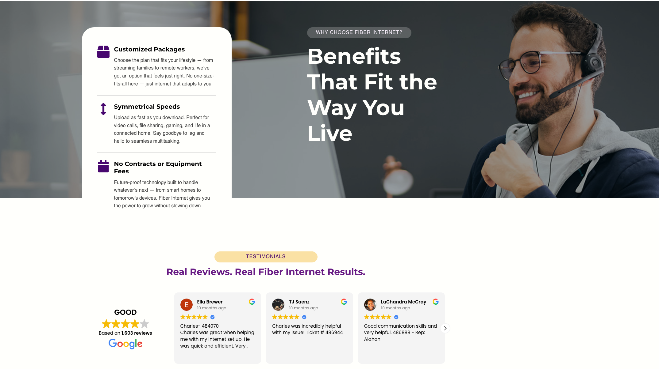
Job: Trust. Split "Benefits That Fit the Way You Live" section (icon list on white + bold headline over dark photo). Below: live Google Reviews carousel — "GOOD" 4.3★ from 1,603 reviews with real customer names and avatars.
06 — Partners + More Info

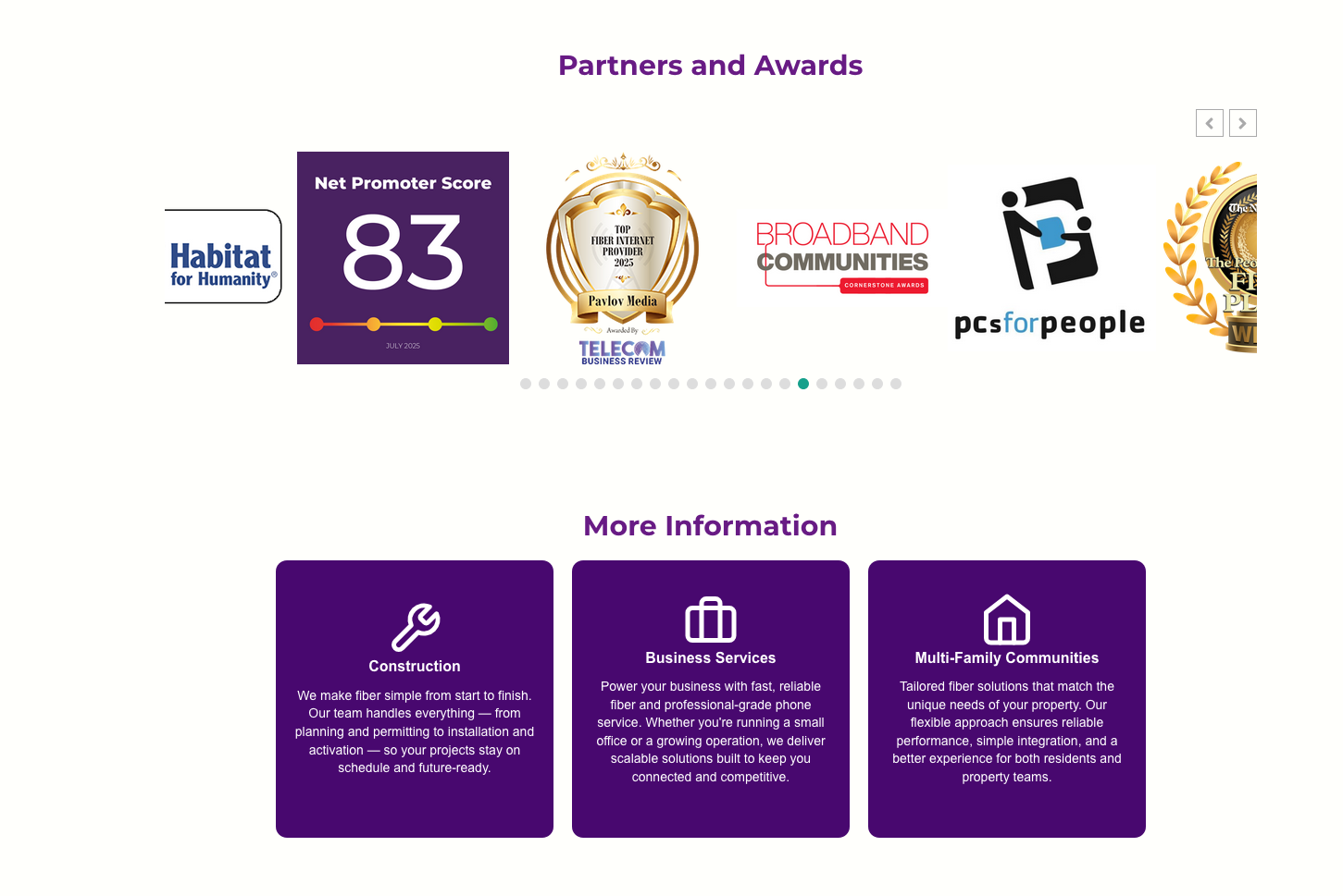
New site partners logo carousel and B2B cards

Job: Community trust + B2B. Scrolling partner logos (Eastern IL Foodbank, Folds of Honor, YMCA, Crisis Nursery, Loaves & Fishes). Three purple cards for Construction / Business Services / Multi-Family — B2B met without competing with the residential flow.
07 — FAQ + CTA + Footer

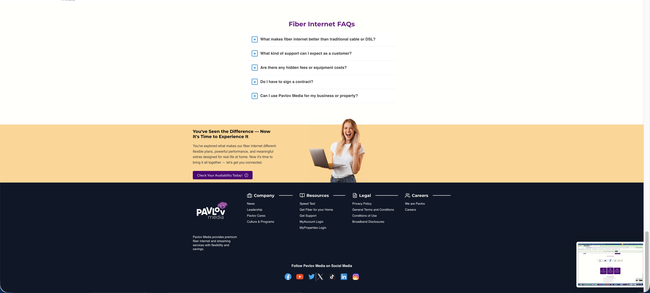
New site FAQ accordion, warm closing CTA, and full footer

Job: Remove doubt + convert. "Fiber Internet FAQs" accordion (5 objection-removing questions). Warm peach "You've Seen the Difference" closing CTA with cut-out woman. Full dark footer with Company / Resources / Legal / Careers columns, 6 social platforms.

New site summary: 10 sections with clear individual jobs · Residential pricing above the fold · 1,603 live Google reviews · Full lifestyle photography throughout · Address search bar as primary CTA · B2B served without noise · FAQ removes last-minute objections · 🌐 Language selector in sticky header · Per-breakpoint mobile tuning via Elementor

Navigation — Zoomed In

From a Cluttered Double Bar to One Clean Header

The navigation bar is the first UI element a visitor processes — before the hero, before the copy. The old site had two stacked nav rows creating immediate cognitive overload while signalling "this site is for businesses." The redesign collapses everything into a single sticky header with one persistent CTA.

Old nav problems: Two rows · 13+ links · B2B-only labels (MDU, Investor Relations) · "Contact Us" is a dead-end form · No language support · Double bar stacks awkwardly on mobile · Sub-nav items irrelevant to residential visitors

New nav wins: One row · Consumer-language labels · Persistent "Check Availability" CTA always visible · Built in Theme Builder — one edit updates every page · 🌐 Language switcher in header · Sticky with backdrop-filter blur · Clean hamburger menu on mobile

Full Comparison

Before vs. After — Every Major Change

Every decision in the redesign had a clear reason — fixing a UX problem, closing a conversion gap, or aligning the page with the residential audience Pavlov Media was growing into.

ElementBefore — 2023After — 2024 Redesign
Colour paletteNear-black backgrounds, deep purple accents. Heavy, corporate, enterprise feel.White + warm cream sections; brand purple as accent only. Light, welcoming, consumer-brand feel.
NavigationTwo stacked nav rows (13+ items): MDU / Business / Home Solutions / Investor Relations + sub-nav. B2B-first. No language option.Single sticky header: logo, consumer-language nav items, one persistent "Check Availability" CTA, 🌐 language selector. Built in Theme Builder.
Primary CTA"Contact Us" button — routes to a generic form. Low conversion intent for residential visitors.Inline address search bar on the hero itself. Starts the sign-up journey immediately. Highest-intent action for a geo-limited ISP.
PhotographyOne dark glowing energy-orb/tablet illustration. Zero lifestyle imagery anywhere on the page.Lifestyle photography throughout — families at home, professionals, technicians, cut-out people on flat colour sections. Warm and relatable.
Primary audienceB2B / property managers / MDU / Investors as primary. Residential buried or absent.Residential consumer-first throughout. B2B needs served in 3 discreet cards after the main residential story — no competition.
Pricing / plansNot on the homepage at all.3 residential plan cards (400Mbps / 1Gbps / 2–8Gbps) with speed badges and "Get Started" buttons immediately below the hero.
Social proofNo reviews, testimonials, or ratings anywhere.Live Google Reviews carousel — 1,603 reviews, 4.3★ — with real customer names, avatars, and timestamps. Zero manual maintenance.
Homepage contentMajority of page taken up by stale news articles from 2020–2021 (press releases, acquisitions). No consumer value.10 purpose-built sections following awareness → interest → trust → decision flow. Each section has one job.
Section labelsNo labelling system. Impossible to orient while scrolling.Pill-shaped category labels above every headline ("WHY US", "TESTIMONIALS", "FIBER HOME INTERNET") — instant scroll context.
White spaceSections cramped together, dense copy blocks, minimal padding. Difficult to scan.80px+ section padding. Alternating white/cream backgrounds create visual separation. Content groups breathe independently.
FAQNot present on the homepage.5-question accordion FAQ placed just before the closing CTA — removes last-minute objections at the decision point.
Partner logosNot present.Scrolling carousel of 20+ community partners (ACS, VA, Feeding America, Humane Society, Folds of Honor). Builds local residential trust.
Language supportEnglish only. No selector anywhere.🌐 Language switcher in the sticky header — accessible on every page view.
Stats / proofB2B metrics: 31 States · 105 University Communities · 564 Properties. Meaningless to residential visitors.Consumer-relevant proof: 4.3★ Google rating, 1,603 reviews, speed tier badges, 5-item benefit checklist.
Footer3 columns, Facebook + LinkedIn only, dark background. No site map, no language option.4-column footer (Company / Resources / Legal / Careers), 6 social platforms, full site map, company tagline.
Build architectureLegacy theme with accumulated redundant plugin scripts and CSS. No design system.Astra theme (zero-bloat base) + Elementor Pro. CSS custom properties define a global token system. Clean, maintainable build.
MobileTheme-default responsive — double nav stacks awkwardly, columns break at odd breakpoints.Per-device controls in Elementor used on every section. Font sizes, padding, grid columns, image cropping individually tuned per breakpoint.

Beyond the Homepage

Landing Pages, AI-Assisted Design & a 65-Page Migration

The homepage rebuild was only one piece of a much larger engagement. The full scope included geo-targeted landing pages, AI-assisted Elementor workflows, and migrating 65 pages of legacy Visual Composer markup into a clean, modern Elementor Pro architecture.

Geo-Targeted Landing Page — Gainesville, FL

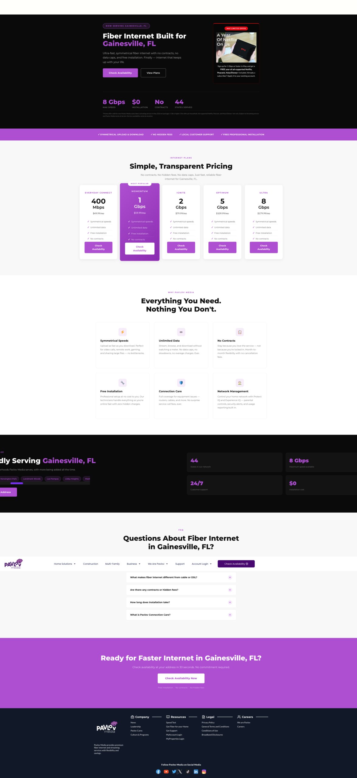
Pavlov Media geo-targeted fiber internet landing page for Gainesville FL — custom city-specific hero, local imagery, address lookup CTA

City-specific fiber landing pages built in Elementor Pro — each with a localised hero, city-name in the headline, tailored body copy, and the same address-lookup CTA flow as the homepage. These pages served as both SEO landing destinations and paid ad targets for Pavlov Media's market-by-market expansion strategy.

🤖

AI-Assisted Elementor Design

AI tools were used throughout the Elementor build process — generating copy variations for A/B testing, producing localised hero imagery for city landing pages via AI image generation, and accelerating layout ideation for the asymmetric content grid. The result: faster iteration cycles without sacrificing design quality or brand consistency.

📦

65-Page Visual Composer Migration

The entire Pavlov Media site — 65 pages of legacy WPBakery / Visual Composer shortcode markup, custom HTML blocks, and inline styles accumulated over nearly a decade — was migrated to Elementor Pro. Each page was rebuilt from scratch rather than converted, ensuring clean markup, consistent global styles, and full compatibility with the new design system.

💎

Expert-Level HTML, CSS & jQuery

Where Elementor's visual controls hit their limits, custom code took over. Hand-written CSS handled the global token system, cut-out photo treatment, sticky nav blur transitions, and logo carousel normalisation. Custom jQuery powered interactive elements — including address lookup integrations, dynamic form logic, and GTM/GA4 event tracking tied to key conversion actions.

The migration scope in numbers: 65 pages rebuilt · Legacy WPBakery shortcodes fully eliminated · Custom HTML/CSS/jQuery preserved and modernised · Global design system applied consistently across every page · Per-page SEO meta, canonical tags, and schema markup reviewed and updated throughout

Elementor Pro Features Used

Builder Capabilities Deployed in This Build

Elementor Pro was used as a full design system — not just a page builder. Theme Builder, Flexbox Containers, global CSS classes, live review integrations, and per-breakpoint controls all played a role in making this homepage both polished and maintainable.

🎯

Theme Builder — Global Header

The sticky header is built in Elementor's Theme Builder, not inline on the page. Any update — copy, CTA, links — applies across every page instantly. Zero duplication.

📐

Flexbox Containers

The newer Flexbox Container system (replacing legacy Section/Column) enabled the asymmetric content grid — mixing tall portrait photo cards with square flat feature cards in a true CSS Grid layout the old column model couldn't support.

🖼️

Background Overlays (per breakpoint)

Built-in overlay controls darken each hero and card photo for text legibility without touching source images. Opacity is set per-device — because the hero crops differently on mobile and white text needs more contrast.

Live Google Reviews Widget

Ratings, reviewer names, avatars, and timestamps pulled live from Google — zero manual maintenance. Carousel styled with custom CSS to match brand colours and typography.

🏷️

Global Reusable CSS Classes

Pill labels, purple CTA buttons, card hover states, and cut-out photo treatment defined as global CSS classes. Changing one class cascades site-wide instantly.

🔁

Logo Carousel + Normalisation

Custom CSS equalises logos of wildly different proportions — fixed-height containers with object-fit:contain and uniform white cell backgrounds across 20+ partner logos.

Accordion FAQ (fully restyled)

Native Accordion widget restyled with purple square toggle icons, hairline dividers, smooth max-height CSS animations, and consistent typography — placed strategically before the final CTA to answer last-minute objections.

📱

Per-Breakpoint Responsive Controls

Every section individually tuned for desktop, tablet, and mobile. Plan cards collapse from 3 columns to single scroll. Hero text scales independently. Address bar padding adjusts. Card grid reflows gracefully at tablet width.

🌍

Multilingual / Language Switcher

🌐 EN language selector added to the sticky header via WordPress multilingual plugin surfaced as an Elementor sticky element — accessible on every page, a meaningful addition for Pavlov Media's diverse residential customer base.

CSS Improvements

Custom CSS: What Elementor Couldn't Do Alone

Elementor Pro handles the bulk of layout and styling visually, but targeted custom CSS was written for spacing tokens, cut-out photo treatment, sticky nav transitions, and logo carousel normalisation.

1. Section Spacing — From Cramped to Breathing

Before — Minimal Padding
Section A — ~16px padding
↕ 8px gap
Section B — ~16px padding
↕ 8px gap
Section C — ~16px padding
After — Generous Breathing Room
Section A — 80px top/bottom padding
↕ background colour change creates separation
Section B — 80px top/bottom padding
↕ background colour change creates separation
Section C — 80px top/bottom padding

2. Global CSS Token System

Before — scattered inline values

/* No system — values in 40+ widgets */

.elementor-section {

  padding: 24px 16px;

}

.some-widget {

  margin-bottom: 12px;

  padding: 20px;

}

/* Repeated inconsistently everywhere */

After — CSS custom properties

:root {

  --section-pad: 80px 32px;

  --card-gap: 24px;

  --card-radius: 14px;

  --purple: #5b0fa8;

  --purple-pale: #f3e8ff;

}

/* Change once, updates everywhere */

3. Cut-Out Photo Treatment

Cut-out photo CSS

.cutout-wrap {

  position: relative;

  overflow: visible;

}

.cutout-wrap img {

  position: absolute;

  bottom: 0;

  height: 115%;

  object-fit: contain;

  object-position: bottom;

}

Sticky nav backdrop blur

.site-header {

  position: sticky;

  top: 0;

  z-index: 999;

  background: rgba(255,255,255,.92);

  backdrop-filter: blur(8px);

  border-bottom: 1px solid rgba(0,0,0,.07);

  transition: box-shadow .25s ease;

}

Accessibility & Inclusivity

Building for Everyone

Accessibility improvements were woven into the rebuild, not bolted on. Higher contrast ratios, cleaner markup, and language support make the redesigned site meaningfully more usable for a wider audience.

🌐

Multilingual Support

Language switcher in the sticky header enables Spanish and other language options. WordPress multilingual plugin with Elementor integration surfaces the selector on every page view.

🎨

Contrast Ratios

The old dark-on-dark combinations (grey text on black) failed WCAG AA thresholds. The redesign uses near-black text on white/cream throughout. White-on-photo text only where overlay opacity guarantees legibility.

⌨️

Keyboard Navigation

Single-row nav with clear focus states replaces the confusing double-bar tab order. The accordion FAQ uses Elementor's native implementation with ARIA expanded/collapsed attributes and full keyboard support.

📱

Mobile Tap Targets

Per-breakpoint Elementor controls ensure tap targets meet minimum 44×44px on mobile. Text never scales below readable sizes. Hamburger menu uses a proper button element, not a div.

🖼️

Alt Text

All lifestyle photos, plan card images, and partner logos updated with descriptive alt text relevant to each image's context and placement — improving both screen reader experience and image SEO.

Performance

Astra theme eliminates the script/CSS bloat of the legacy theme. Elementor lazy-loads images by default. Consolidated global styles reduce render-blocking CSS. Faster LCP directly helps lower-bandwidth users.

Design Impact

What the Redesign Delivered

The homepage redesign fundamentally repositioned Pavlov Media's web presence — from an enterprise/B2B-coded site to a consumer-first fiber internet brand — while keeping institutional audiences served in a non-competing way.

6→10
Sections with clear individual jobs
1
Address search bar on the hero (zero before)
1,603
Live Google reviews embedded (was zero)
2→1
Nav bars (double stack → single sticky)
20+
Community partner logos in trust carousel
🌐
Language selector added to persistent header

Key architectural decision: B2B audiences are not ignored — they get 3 dedicated cards well into the page — but the residential consumer flow is never interrupted by B2B language. This is the critical structural change that makes the page work for both audiences without compromising either.

Pavlov Media Homepage Redesign · Case Study by Tim Rhoads / SolarBlu.net LLC

Work completed while serving as Web Developer at Pavlov Media · 2023–2024

SolarBlu.net · WordPress + Elementor Pro · Astra Theme · Custom CSS

WordPress
Elementor Pro
Custom CSS
UX Design
Responsive Design
Astra Theme
Consumer Conversion
Google Reviews Integration
Multilingual
Accessibility
Theme Builder
Flexbox Containers

Custom PHP Development

We Don’t Outsource Your Code — Ever.

Security Perspective

We Don’t Outsource
Your Code — Ever.

Your codebase is your business. Your credentials are your livelihood. Here’s the data behind why we keep everything in-house, and what that means for every project we touch.

By SolarBlu.net
·
Web Development & Hosting Security
·
Sources: Verizon DBIR 2024–2025 · Wordfence · Patchstack

In the web development industry, outsourcing code is commonplace. Development shops subcontract work overseas, hand off entire codebases to third-party teams in other countries, and trust that an NDA signed in a foreign jurisdiction will protect their clients. We’ve watched this practice grow for decades. And we want to be absolutely clear about where we stand: we don’t do it. Not for cost savings. Not for speed. Not under any circumstances.

This isn’t just a preference — it’s a security posture backed by hard data. The statistics coming out of the cybersecurity industry in 2024 and 2025 tell a disturbing story about what happens when your code, your credentials, and your business logic leave your direct control.

“Once your source code leaves your hands, you’ve handed over the keys to your entire business — and in many jurisdictions, you have no legal recourse to get them back.”

30%
of all confirmed data breaches involved a third-party vendor or partner
Verizon DBIR 2025

increase in third-party breach involvement in a single year (15% → 30%)
Verizon DBIR 2024 vs 2025
81%
of third-party-involved breaches were classified as full system intrusions
Verizon DBIR 2025
7,966
new WordPress vulnerabilities discovered in 2024 — 22 per day
Wordfence / Patchstack 2025

Verizon DBIR — Third-party breach involvement over time
% of confirmed breaches with 3rd-party involvement

Verizon DBIR Third-party breach involvement 2022-2025 0% 10% 20% 30% 40% 9% 15% 15% 30% 2022 DBIR 2023 DBIR 2024 DBIR 2025 DBIR

Source: Verizon Data Breach Investigations Reports 2022–2025

What “Outsourcing Your Code” Actually Means

When a development agency sends your project to an overseas contractor, a few things happen that most clients never think about. The contractor receives your full source code — your business logic, your database schemas, your API integrations, your authentication flows. In many cases, they receive environment files, staging credentials, and FTP or SSH access. Sometimes they receive production credentials.

From that point forward, you have no visibility into who has seen your code, who has copied it, who has stored it on their personal machine, or what they’ve learned from it. The development shop’s NDA with the contractor means nothing if that contractor operates in a country with weak IP law enforcement, or if the individual developer decides to keep a local copy for “reference.”

⚠ The Real Risk

Hardcoded credentials, API keys, database connection strings, and .env files are almost always present in codebases handed to outsourced developers. In the wrong hands, these aren’t just a liability — they’re an open door into your production systems.

Supply chain attacks: the slow-burn threat

Beyond outright theft, there’s a subtler and increasingly common risk: a developer with access to your codebase inserts a small, benign-looking piece of malicious code. It could be a modified dependency, an additional function tucked into a utility file, or a logging call that exfiltrates session tokens. You deploy it. It sits dormant. And months later, someone has access to your database, your customer records, or your admin panel.

This is not a hypothetical. This is how several of the highest-profile supply chain attacks in recent years have operated, and the Verizon DBIR explicitly tracks it as a growing attack category under third-party and software supply chain breaches.

WordPress new vulnerabilities per year — a growing attack surface
New vulnerabilities disclosed

WordPress vulnerabilities per year 2021-2024 0 2k 4k 6k 8k 1,682 2,370 5,943 7,966 2021 2022 2023 2024

Source: Wordfence 2024 Annual WordPress Security Report · Patchstack State of WordPress Security 2025

The WordPress Problem Is Getting Worse

WordPress powers over 40% of the entire web — and it is the most actively targeted platform in existence. The vulnerability numbers from 2024 are sobering: nearly 8,000 new security flaws disclosed in a single year. That’s one new vulnerability discovered every 65 minutes, around the clock.

What makes this especially relevant to the outsourcing discussion: 35% of those vulnerabilities remained unpatched as of 2025. That means over one-third of known plugin and theme flaws had no fix available — and developers either didn’t know or couldn’t reach the vendor. When you add an outsourced developer to this picture — someone with lower accountability and potentially malicious intent — the unpatched vulnerability isn’t a bug. It becomes a scheduled entry point.

Verizon DBIR 2024 — root causes of confirmed breaches
Ransomware/extortion
Human element
Stolen credentials
Third-party/vendor
Vuln exploitation

Verizon DBIR 2024 breach root causes 0% 20% 40% 60% 80% Ransomware/extortion 68% Human element 68% Stolen credentials 24% Third-party/vendor 15% Vuln exploitation 14%

Source: Verizon Data Breach Investigations Report 2024 · 10,626 confirmed breaches analyzed

Small Sites Are Not Safe by Obscurity

One of the most persistent myths in web security is that small websites don’t get targeted. Why would an attacker go after a local business site or a small e-commerce store when there are bigger fish to fry?

The data says otherwise. In 2024, 73% of WordPress attacks targeted sites with fewer than 1,000 monthly visitors. Small sites get targeted precisely because they’re easier. They’re less likely to have monitoring in place. They’re less likely to notice a breach quickly. And they’re often running outdated plugins and themes — including ones installed by an outsourced developer who long since stopped caring about your project.

For small businesses, a breach isn’t an inconvenience. It’s potentially a business-ending event. Customer data exposed, PCI compliance violated, Google blacklisting the domain — the downstream consequences of a single compromised credential can take years to fully repair.

“73% of WordPress attacks in 2024 targeted sites with fewer than 1,000 monthly visitors. Small doesn’t mean safe.”

Our Commitment to Your Project

With nearly 30 years in web development and hosting, we’ve seen what happens when code and credentials get into the wrong hands. We built our operation around a simple principle: your project stays with us. Period.

  • All development work is performed in-house by our own team — no subcontracting, no offshore handoffs, ever.
  • Your credentials, API keys, and environment files are stored securely and never shared with third parties.
  • We maintain full chain-of-custody on every codebase we touch, from first commit to deployment.
  • Access to your systems is limited to only what is needed for the specific task at hand — principle of least privilege, always.
  • We perform regular security reviews on client sites we host, including plugin and theme vulnerability monitoring.
  • If a security issue is discovered in your stack, you hear about it from us — directly and immediately.

When you work with SolarBlu.net, you’re not a ticket in a queue handed off to whoever is cheapest that week. You’re a client with a real business, real data, and real exposure if something goes wrong. We take that seriously.

What to Ask Any Developer Before You Hire Them

Whether you work with us or not, these questions will reveal a lot about how seriously a development shop takes your security:

1. Do you use subcontractors or offshore labor for any portion of the work?

If the answer is yes, ask specifically who will have access to your codebase, credentials, and staging environment. Get it in writing. Demand to know which countries are involved and what legal framework governs the relationship.

2. How do you handle credential management?

If a developer asks for your admin password over email or Slack, that’s a red flag. Credentials should be shared through a password manager with access revocation capability, never stored in plain text, and never shared more broadly than necessary.

3. What’s your offboarding process?

When a project ends or a developer is removed from your team, what happens to their access? Are passwords rotated? Is SSH access revoked? Are API keys regenerated? A shop that can’t answer this clearly has never thought about it.

4. Can you show me your security practices documentation?

Any professional operation should be able to articulate how they handle client data. If the answer is a shrug, you have your answer about how they treat your information.

The cybersecurity data is clear: third-party access is one of the fastest-growing vectors for data breaches. In an industry where outsourcing is treated as a feature, we treat keeping your work in-house as a non-negotiable standard. That’s not a marketing line. It’s how we’ve operated for 30 years, and it’s how we intend to keep operating.

Your code is your business. We treat it accordingly.

SolarBlu
Scroll to Top