Pavlov Media
Homepage Redesign
A full ground-up rebuild in WordPress + Elementor Pro — taking a dark, B2B-coded legacy homepage and transforming it into a warm, consumer-first fiber internet experience built for residential sign-ups.
Overview
Why the Old Site Needed a Ground-Up Rethink
Pavlov Media provides fiber-optic internet to residential communities and MDUs across 44 US states. Over several years their homepage had accumulated layer upon layer of incremental changes on top of a legacy WordPress theme — the result was a dark, text-heavy, enterprise-coded experience that no longer matched their fast-growing residential consumer audience.
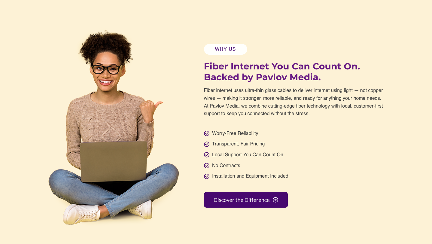
The core problem: Every design decision on the original homepage — the dual navigation, the near-black palette, the B2B copywriting, the complete absence of pricing — was aimed at property managers and institutions. When a regular homeowner landed on the page there was nothing pulling them forward: no lifestyle imagery, no address lookup, no reviews, no plain-language value props, and no clear path to actually sign up.
The redesign meant starting over inside Elementor Pro on a clean Astra theme base — defining a global design system first (colours, typography, spacing tokens, reusable CSS classes), then building every section from scratch, and finally layering targeted custom CSS for anything the builder couldn't handle alone.
Hero — Before & After
The First Thing Visitors See
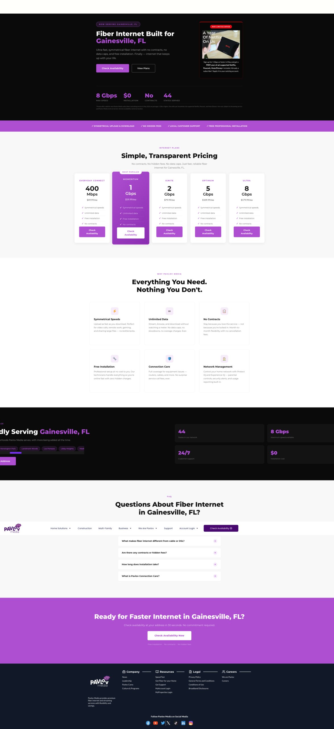
The hero is the thesis of the homepage. It tells visitors in 2–3 seconds whether this site is for them. The old hero communicated "enterprise tech company." The new hero communicates "this is for your home, and here's how to get started right now."
The address search bar is the single biggest conversion improvement on the page. For a geo-limited ISP, every potential customer's first question is "do you serve my address?" Answering that on the hero — before any scrolling — removes the biggest barrier to entry. Visitors who confirm their address are already partially converted.
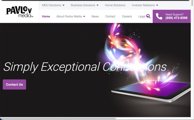
The Old Site — Section by Section
2023 Homepage (Archived March 8, 2023)
The 2023 homepage had 6 sections with no connecting visual rhythm, no residential pricing, no reviews, and no address lookup. Every section was written for property managers and institutional procurement teams rather than homeowners.
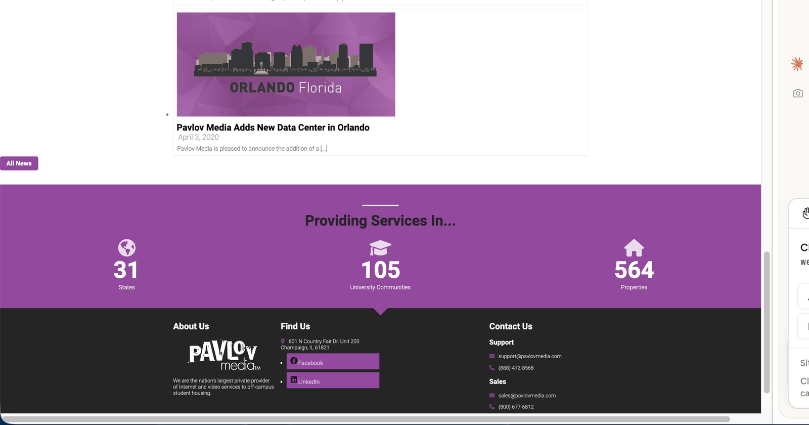
Old site summary: 6 sections · 0 residential pricing · 0 reviews or social proof · 0 lifestyle photography · 0 address lookup · All stats aimed at institutional buyers · Stale news content · Navigation designed entirely for B2B audiences · No language support · No mobile optimisation beyond theme defaults
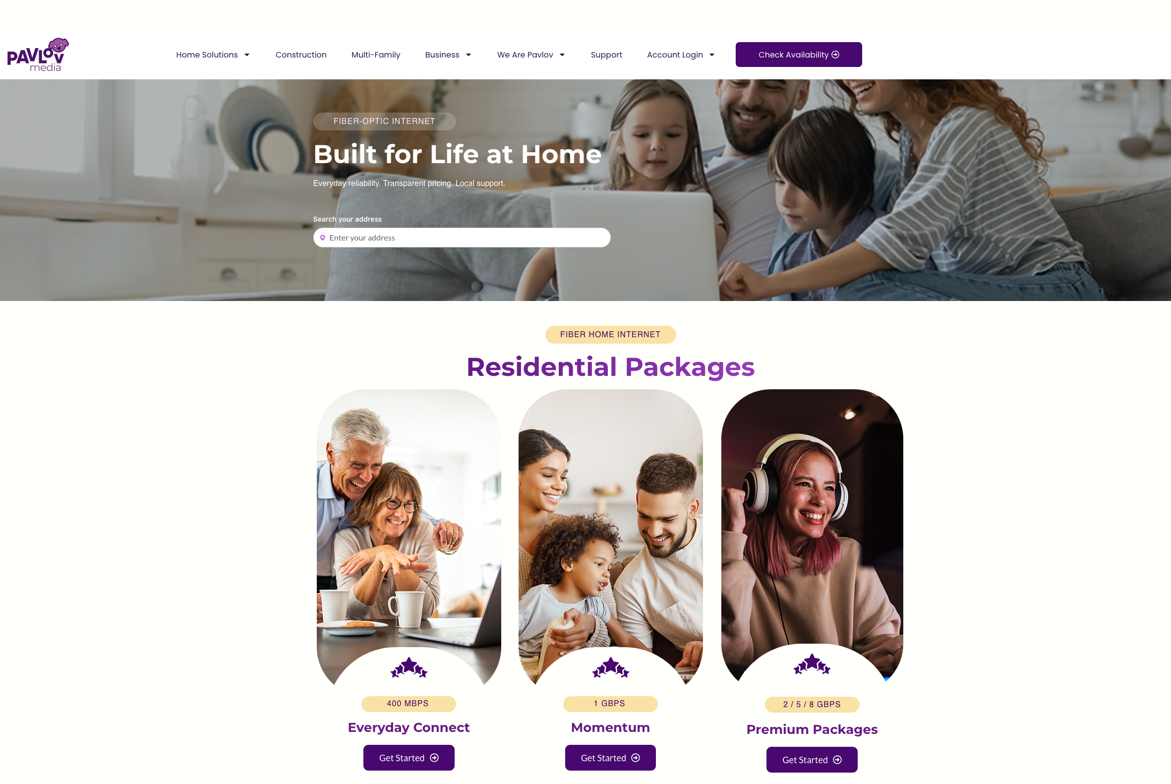
The New Site — Section by Section
2024 Redesign (10 Sections)
The redesign follows a deliberate awareness → interest → trust → decision information flow. Each section has a single job. White and cream backgrounds alternate for natural visual rest. B2B audiences are served — but in a dedicated card section that doesn't disrupt the residential flow.
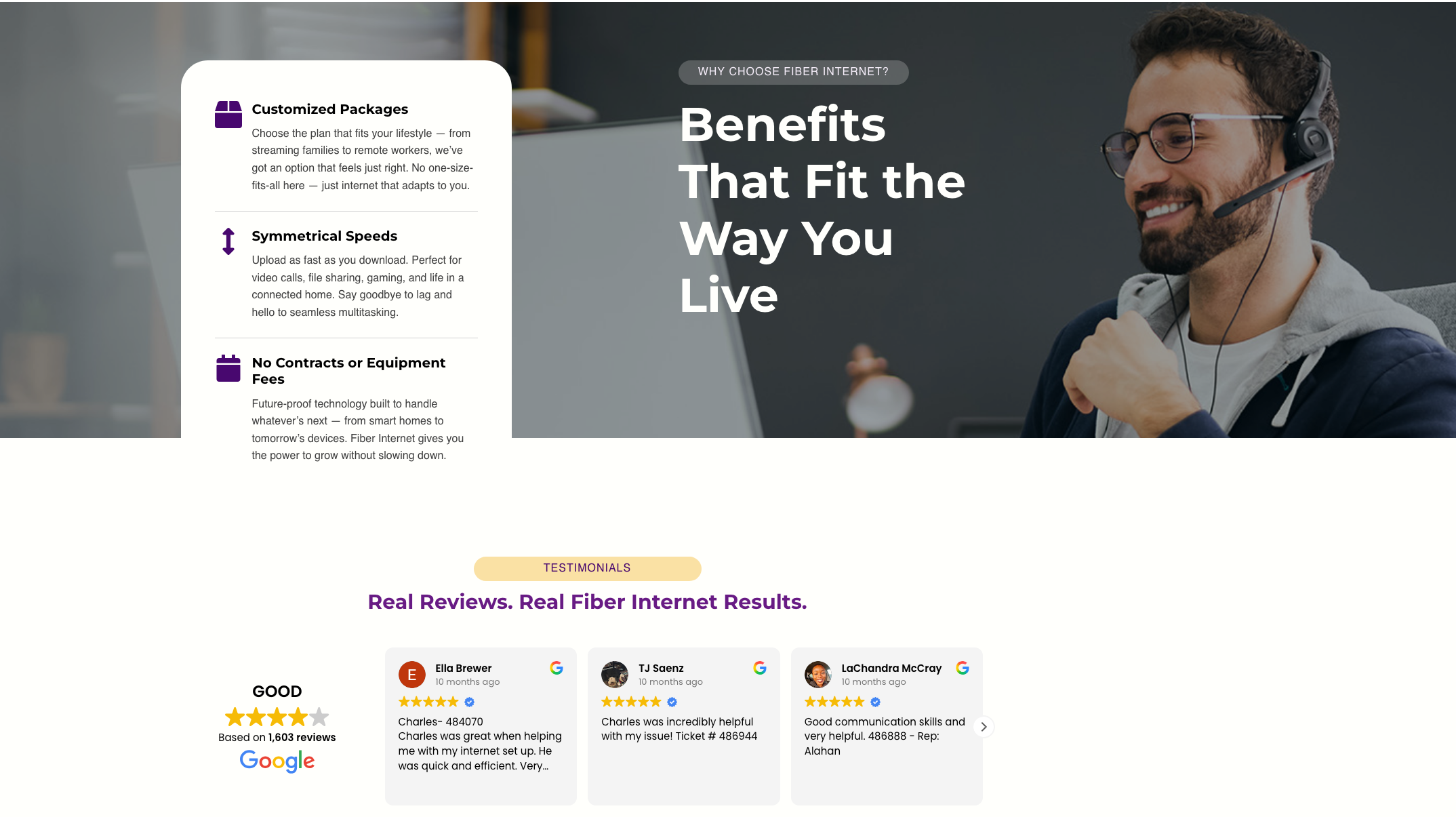
New site summary: 10 sections with clear individual jobs · Residential pricing above the fold · 1,603 live Google reviews · Full lifestyle photography throughout · Address search bar as primary CTA · B2B served without noise · FAQ removes last-minute objections · 🌐 Language selector in sticky header · Per-breakpoint mobile tuning via Elementor
Navigation — Zoomed In
From a Cluttered Double Bar to One Clean Header
The navigation bar is the first UI element a visitor processes — before the hero, before the copy. The old site had two stacked nav rows creating immediate cognitive overload while signalling "this site is for businesses." The redesign collapses everything into a single sticky header with one persistent CTA.
Old nav problems: Two rows · 13+ links · B2B-only labels (MDU, Investor Relations) · "Contact Us" is a dead-end form · No language support · Double bar stacks awkwardly on mobile · Sub-nav items irrelevant to residential visitors
New nav wins: One row · Consumer-language labels · Persistent "Check Availability" CTA always visible · Built in Theme Builder — one edit updates every page · 🌐 Language switcher in header · Sticky with backdrop-filter blur · Clean hamburger menu on mobile
Full Comparison
Before vs. After — Every Major Change
Every decision in the redesign had a clear reason — fixing a UX problem, closing a conversion gap, or aligning the page with the residential audience Pavlov Media was growing into.
| Element | Before — 2023 | After — 2024 Redesign |
|---|---|---|
| Colour palette | Near-black backgrounds, deep purple accents. Heavy, corporate, enterprise feel. | White + warm cream sections; brand purple as accent only. Light, welcoming, consumer-brand feel. |
| Navigation | Two stacked nav rows (13+ items): MDU / Business / Home Solutions / Investor Relations + sub-nav. B2B-first. No language option. | Single sticky header: logo, consumer-language nav items, one persistent "Check Availability" CTA, 🌐 language selector. Built in Theme Builder. |
| Primary CTA | "Contact Us" button — routes to a generic form. Low conversion intent for residential visitors. | Inline address search bar on the hero itself. Starts the sign-up journey immediately. Highest-intent action for a geo-limited ISP. |
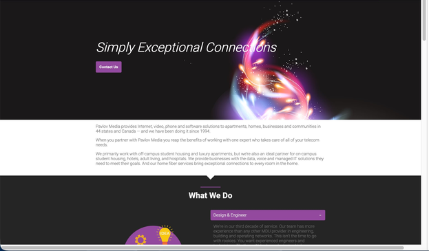
| Photography | One dark glowing energy-orb/tablet illustration. Zero lifestyle imagery anywhere on the page. | Lifestyle photography throughout — families at home, professionals, technicians, cut-out people on flat colour sections. Warm and relatable. |
| Primary audience | B2B / property managers / MDU / Investors as primary. Residential buried or absent. | Residential consumer-first throughout. B2B needs served in 3 discreet cards after the main residential story — no competition. |
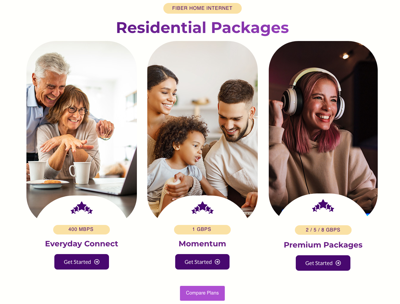
| Pricing / plans | Not on the homepage at all. | 3 residential plan cards (400Mbps / 1Gbps / 2–8Gbps) with speed badges and "Get Started" buttons immediately below the hero. |
| Social proof | No reviews, testimonials, or ratings anywhere. | Live Google Reviews carousel — 1,603 reviews, 4.3★ — with real customer names, avatars, and timestamps. Zero manual maintenance. |
| Homepage content | Majority of page taken up by stale news articles from 2020–2021 (press releases, acquisitions). No consumer value. | 10 purpose-built sections following awareness → interest → trust → decision flow. Each section has one job. |
| Section labels | No labelling system. Impossible to orient while scrolling. | Pill-shaped category labels above every headline ("WHY US", "TESTIMONIALS", "FIBER HOME INTERNET") — instant scroll context. |
| White space | Sections cramped together, dense copy blocks, minimal padding. Difficult to scan. | 80px+ section padding. Alternating white/cream backgrounds create visual separation. Content groups breathe independently. |
| FAQ | Not present on the homepage. | 5-question accordion FAQ placed just before the closing CTA — removes last-minute objections at the decision point. |
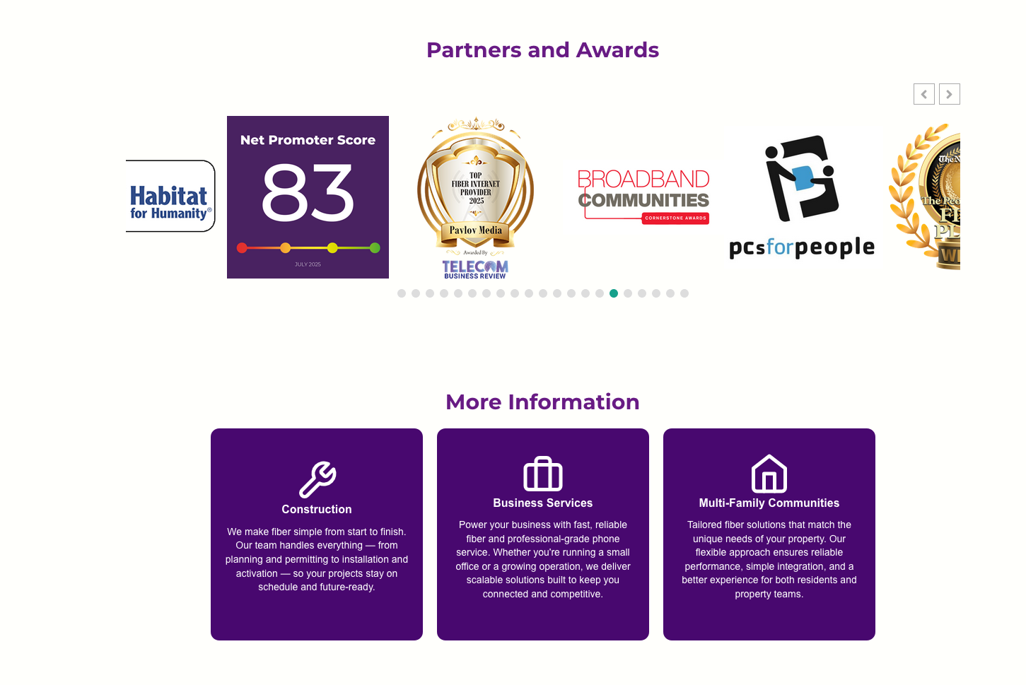
| Partner logos | Not present. | Scrolling carousel of 20+ community partners (ACS, VA, Feeding America, Humane Society, Folds of Honor). Builds local residential trust. |
| Language support | English only. No selector anywhere. | 🌐 Language switcher in the sticky header — accessible on every page view. |
| Stats / proof | B2B metrics: 31 States · 105 University Communities · 564 Properties. Meaningless to residential visitors. | Consumer-relevant proof: 4.3★ Google rating, 1,603 reviews, speed tier badges, 5-item benefit checklist. |
| Footer | 3 columns, Facebook + LinkedIn only, dark background. No site map, no language option. | 4-column footer (Company / Resources / Legal / Careers), 6 social platforms, full site map, company tagline. |
| Build architecture | Legacy theme with accumulated redundant plugin scripts and CSS. No design system. | Astra theme (zero-bloat base) + Elementor Pro. CSS custom properties define a global token system. Clean, maintainable build. |
| Mobile | Theme-default responsive — double nav stacks awkwardly, columns break at odd breakpoints. | Per-device controls in Elementor used on every section. Font sizes, padding, grid columns, image cropping individually tuned per breakpoint. |
Beyond the Homepage
Landing Pages, AI-Assisted Design & a 65-Page Migration
The homepage rebuild was only one piece of a much larger engagement. The full scope included geo-targeted landing pages, AI-assisted Elementor workflows, and migrating 65 pages of legacy Visual Composer markup into a clean, modern Elementor Pro architecture.
AI-Assisted Elementor Design
AI tools were used throughout the Elementor build process — generating copy variations for A/B testing, producing localised hero imagery for city landing pages via AI image generation, and accelerating layout ideation for the asymmetric content grid. The result: faster iteration cycles without sacrificing design quality or brand consistency.
65-Page Visual Composer Migration
The entire Pavlov Media site — 65 pages of legacy WPBakery / Visual Composer shortcode markup, custom HTML blocks, and inline styles accumulated over nearly a decade — was migrated to Elementor Pro. Each page was rebuilt from scratch rather than converted, ensuring clean markup, consistent global styles, and full compatibility with the new design system.
Expert-Level HTML, CSS & jQuery
Where Elementor's visual controls hit their limits, custom code took over. Hand-written CSS handled the global token system, cut-out photo treatment, sticky nav blur transitions, and logo carousel normalisation. Custom jQuery powered interactive elements — including address lookup integrations, dynamic form logic, and GTM/GA4 event tracking tied to key conversion actions.
The migration scope in numbers: 65 pages rebuilt · Legacy WPBakery shortcodes fully eliminated · Custom HTML/CSS/jQuery preserved and modernised · Global design system applied consistently across every page · Per-page SEO meta, canonical tags, and schema markup reviewed and updated throughout
Elementor Pro Features Used
Builder Capabilities Deployed in This Build
Elementor Pro was used as a full design system — not just a page builder. Theme Builder, Flexbox Containers, global CSS classes, live review integrations, and per-breakpoint controls all played a role in making this homepage both polished and maintainable.
Theme Builder — Global Header
The sticky header is built in Elementor's Theme Builder, not inline on the page. Any update — copy, CTA, links — applies across every page instantly. Zero duplication.
Flexbox Containers
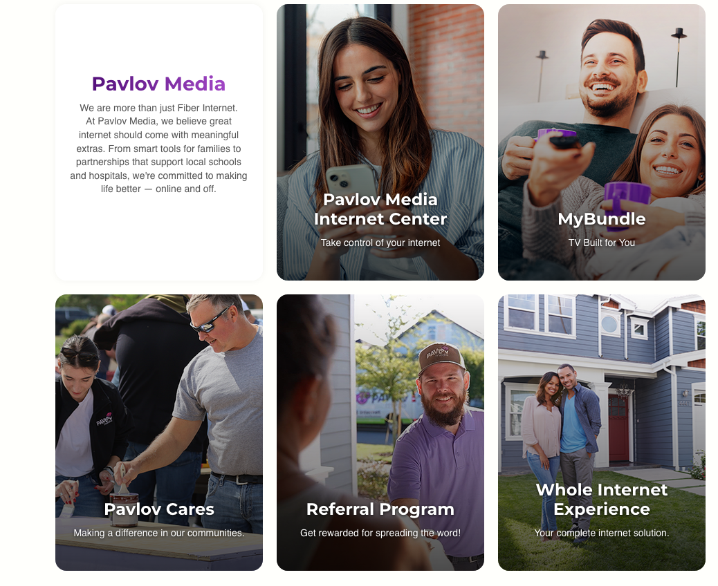
The newer Flexbox Container system (replacing legacy Section/Column) enabled the asymmetric content grid — mixing tall portrait photo cards with square flat feature cards in a true CSS Grid layout the old column model couldn't support.
Background Overlays (per breakpoint)
Built-in overlay controls darken each hero and card photo for text legibility without touching source images. Opacity is set per-device — because the hero crops differently on mobile and white text needs more contrast.
Live Google Reviews Widget
Ratings, reviewer names, avatars, and timestamps pulled live from Google — zero manual maintenance. Carousel styled with custom CSS to match brand colours and typography.
Global Reusable CSS Classes
Pill labels, purple CTA buttons, card hover states, and cut-out photo treatment defined as global CSS classes. Changing one class cascades site-wide instantly.
Logo Carousel + Normalisation
Custom CSS equalises logos of wildly different proportions — fixed-height containers with object-fit:contain and uniform white cell backgrounds across 20+ partner logos.
Accordion FAQ (fully restyled)
Native Accordion widget restyled with purple square toggle icons, hairline dividers, smooth max-height CSS animations, and consistent typography — placed strategically before the final CTA to answer last-minute objections.
Per-Breakpoint Responsive Controls
Every section individually tuned for desktop, tablet, and mobile. Plan cards collapse from 3 columns to single scroll. Hero text scales independently. Address bar padding adjusts. Card grid reflows gracefully at tablet width.
Multilingual / Language Switcher
🌐 EN language selector added to the sticky header via WordPress multilingual plugin surfaced as an Elementor sticky element — accessible on every page, a meaningful addition for Pavlov Media's diverse residential customer base.
CSS Improvements
Custom CSS: What Elementor Couldn't Do Alone
Elementor Pro handles the bulk of layout and styling visually, but targeted custom CSS was written for spacing tokens, cut-out photo treatment, sticky nav transitions, and logo carousel normalisation.
1. Section Spacing — From Cramped to Breathing
2. Global CSS Token System
/* No system — values in 40+ widgets */
.elementor-section {
padding: 24px 16px;
}
.some-widget {
margin-bottom: 12px;
padding: 20px;
}
/* Repeated inconsistently everywhere */
:root {
--section-pad: 80px 32px;
--card-gap: 24px;
--card-radius: 14px;
--purple: #5b0fa8;
--purple-pale: #f3e8ff;
}
/* Change once, updates everywhere */
3. Cut-Out Photo Treatment
.cutout-wrap {
position: relative;
overflow: visible;
}
.cutout-wrap img {
position: absolute;
bottom: 0;
height: 115%;
object-fit: contain;
object-position: bottom;
}
.site-header {
position: sticky;
top: 0;
z-index: 999;
background: rgba(255,255,255,.92);
backdrop-filter: blur(8px);
border-bottom: 1px solid rgba(0,0,0,.07);
transition: box-shadow .25s ease;
}
Accessibility & Inclusivity
Building for Everyone
Accessibility improvements were woven into the rebuild, not bolted on. Higher contrast ratios, cleaner markup, and language support make the redesigned site meaningfully more usable for a wider audience.
Multilingual Support
Language switcher in the sticky header enables Spanish and other language options. WordPress multilingual plugin with Elementor integration surfaces the selector on every page view.
Contrast Ratios
The old dark-on-dark combinations (grey text on black) failed WCAG AA thresholds. The redesign uses near-black text on white/cream throughout. White-on-photo text only where overlay opacity guarantees legibility.
Keyboard Navigation
Single-row nav with clear focus states replaces the confusing double-bar tab order. The accordion FAQ uses Elementor's native implementation with ARIA expanded/collapsed attributes and full keyboard support.
Mobile Tap Targets
Per-breakpoint Elementor controls ensure tap targets meet minimum 44×44px on mobile. Text never scales below readable sizes. Hamburger menu uses a proper button element, not a div.
Alt Text
All lifestyle photos, plan card images, and partner logos updated with descriptive alt text relevant to each image's context and placement — improving both screen reader experience and image SEO.
Performance
Astra theme eliminates the script/CSS bloat of the legacy theme. Elementor lazy-loads images by default. Consolidated global styles reduce render-blocking CSS. Faster LCP directly helps lower-bandwidth users.
Design Impact
What the Redesign Delivered
The homepage redesign fundamentally repositioned Pavlov Media's web presence — from an enterprise/B2B-coded site to a consumer-first fiber internet brand — while keeping institutional audiences served in a non-competing way.
Key architectural decision: B2B audiences are not ignored — they get 3 dedicated cards well into the page — but the residential consumer flow is never interrupted by B2B language. This is the critical structural change that makes the page work for both audiences without compromising either.