
✨ Advanced Themer 13
Custom Visual Composer Components for WordPress
NEW UPGRADE
🚀 The Problem We Solved
Our clients at SolarBlu kept asking for the same custom components across different projects. Hero sections, pricing tables, team showcases, testimonials... We thought: "Why not build our own component library that works seamlessly with Visual Composer?"
And so, Advanced Themer 13 was born - a custom Visual Composer Website Builder (VCWB) element pack that gives our clients (and yours!) beautiful, ready-to-use components with a single click.
💡 The Challenge
Visual Composer v45+ uses a React-based API with a specific webpack bundle format called vcvWebpackJsonp4x. Getting custom elements to register properly required:
- Exact babel version compatibility (7.19.x - not newer!)
- Webpack 5.74.0 (newer versions conflict with VC's internals)
- Classic React.createElement (not React 18's new JSX transform)
- Proper PHP registration via the
vcv:apihook
🎨 What's Included
9 custom components, all styled with our signature dark theme and gold accents:
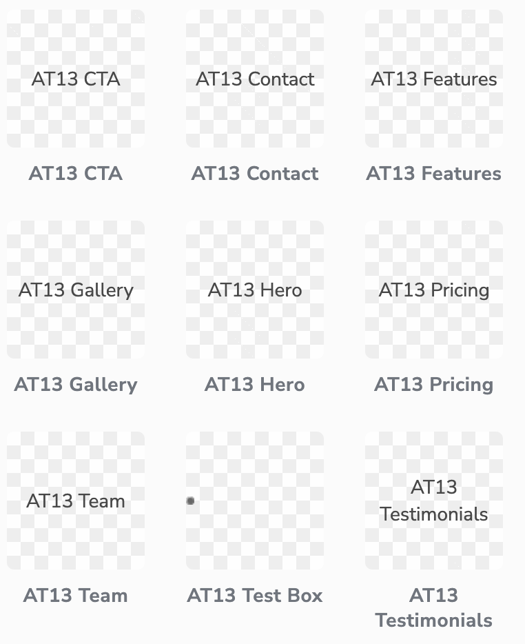
All 9 components visible in the Visual Composer element library
🛠️ Technical Deep Dive
For the developers out there, here's what makes this work:
Bundle Format
(self["vcvWebpackJsonp4x"] = self["vcvWebpackJsonp4x"] || []).push([["element"],{...}]);This special format allows VC's runtime to load and execute custom element code.
Component Structure
import React from 'react'

import { getService } from 'vc-cake'
const vcvAPI = getService('api')
export default class MyElement extends vcvAPI.elementComponent {

  render() {

    const { id, atts, editor } = this.props

    // Your JSX here

  }

}
PHP Registration
add_action('vcv:api', function ($api) {

  $api->elements->add(

    $manifestPath,

    $elementBaseUrl

  );

});
Tech Stack
Webpack 5.74.0
Babel 7.19.x
PHP 8.x
WordPress 6.x
Visual Composer 45+
🎨 Design System
All components follow our consistent design language:
- Background: #0A0A0A (Deep black)
- Primary Text: #FFD700 (Gold)
- Secondary Text: #C0C0C0 (Silver)
- Border Radius: 12px
- Spacing: 20px padding
- Hover Effects: Gold border glow
All 9 Advanced Themer 13 components ready to use in Visual Composer
🚀 For Our Clients
When you work with SolarBlu, you get access to these custom components as part of our Advanced Themer 13 package. No more cookie-cutter templates - your site gets unique, branded components that stand out.
✨ Benefits
- 🎨 Consistent branding across all pages
- ⚡ Faster development (reusable components)
- 📱 Fully responsive out of the box
- 🔧 Easy customization via Visual Composer
- 🚀 Optimized for performance
Ready to Upgrade Your Site?
Get Advanced Themer 13 and transform your Visual Composer experience
📝 Behind the Scenes
This project was a labor of love (and frustration 😅). We spent hours debugging webpack configurations, babel version conflicts, and React JSX transforms. The key breakthrough was discovering that Visual Composer's runtime expects classic React.createElement calls, not the modern JSX transform introduced in React 18.
We also learned that VC's vc-webpack-vendors@3.3.3 package has very specific peer dependency requirements:
// package.json

"devDependencies": {

  "@babel/core": "7.19.3",

  "@babel/preset-env": "7.19.4",

  "@babel/preset-react": "7.18.6",

  "webpack": "5.74.0",

  "vc-webpack-vendors": "3.3.3"

}
Any deviation from these versions results in cryptic runtime errors. But now that we've cracked the code, we can build custom components quickly and efficiently!

The SolarBlu development team hard at work
🎉 Success!
After hours of debugging webpack configurations and babel version conflicts, all 9 components now appear perfectly in the Visual Composer editor. Our clients can simply drag and drop these components to build beautiful pages in minutes.